Examining Evidence: Did Duchamp simply use a photograph of “tossed cubes” to create his 1925 Chess Poster?
Introduction
click to enlarge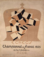
Figure 1
Marcel Duchamp, Poster
for the Third French Chess
Championship,1925
Rhonda Roland Shearer Collection
Duchamp claimed that he created his 1925 Poster for the Third French Chess Championshipfrom a photograph (Fig. 1). Schwarz writes in his Catalogue Raisonné of Duchamp’s works (708):
To make this image, Duchamp tossed an “accumulation” of building blocks into a net bag, then photographed it, printing an enlargement of the picture that eliminated all details except the chance configuration of the blocks in the net. This enlargement was the basis for the final drawing in which he colored the cubes light pink and black. (1)
Duchamp’s explanation, which sounds direct, simple and plausible, was the basis for the final drawing in which he colored the cubes beige, pinkish brown and black.This explanation has also remained unchallenged by scholars. Francis Naumann writes: “The position of the cubes–their three visible sides colored black, white and beige–was determined, as Duchamp later explained,by tossing them into the air and taking a picture” (101, 103).(2)
If Duchamp’s positioning of the cubes in his 1925 Chess Poster came “readymade”from a photograph that he took of tumbling blocks in a net, then we should be able to take various camera lenses used in 1925, place cubes in the positions depicted, and be able to generate a “photograph”matching Duchamp’s poster.
We tried this experiment using computer modeling and animation software, and made a surprising discovery. In order to co-exist simultaneously in the spatial position that Duchamp depicts in his poster, the individual cubes that Duchamp photographed would have to have interpenetrating surfaces, edges and vertices–a completely different scenario and physical reality from Duchamp’s story of photographing free falling cubes.
Step 1 Look at the Poster itself
click to enlarge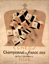
Figure 2
Numbered diagram of the
Poster for the Third
French Chess Championship (1925)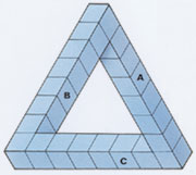
Figure 3
Oscar Reutersvärd,
The Impossible T
ri-Bar, 1934
Examine Figure 2 and more specifically cube 2 or cube 11. The shapes of these cubes, as well as others, appear to be anomalous. In other words,these objects are not symmetrical cubes with six square sides, at right angles to each other and depicted with edges that follow all the rules of perspective, as would be captured by a photographic lens. Cube 2’s black top square appears smaller than the vertical length of its cream colored square, instead of the same size and symmetry as in our expectation and prior experience of cubes drawn in perspective. We note the same situation for cube 16. The pinkish brown cube’s vertical square (on the right side) seems taller than wide, when carefully compared to the shape of the top black square. The more you study these individual cubes by observation alone, even without test or measure, the more maddening the subtle feeling of contradiction becomes–from “yeah they’re cubes” to the eye, to “what the hell, something is wrong with these cube shapes when I compare the squares to each other more carefully”in the mind.
We noted the similarity between the shifting sense from distortion to regularity (or non-cubes to cubes) in Duchamp’s Chess Poster, and a class of optical illusions called “impossible figures” and named by Penrose and Penrose in the 1950s (R. R. Shearer, “Marcel Duchamp’s Impossible Bed and Other “Not” Readymade Objects,”Part I and Part II)(3)Impossible Figures, such as “The Impossible Tri-Bar” discovered by Oscar Reutersvärd in 1934, (See figure 3), characteristically capture us in a cycle of acceptance based on familiar visual cues, followed by a looping back to rejection resulting from nagging contradictory information. Then, after further mental examination, we again visually accept, but then again reject, what we see, ad infinitum. Nigel Rogers, in his book Incredible Optical Illusions, writes about the tri-bar figure: “All those sides appear to be perpendicular to each other and to form a neat, closed triangle. But when you add up the sums of their three right-angled corners, you reach a total of 270 degrees–that is 90 degrees more than is mathematically possible” (62). (4)
In other words,Reutersvärd squeezed into his representation (and into triangles themselves which, in Euclidean space, are defined as limited to 180 degrees) more degrees of freedom than would be allowed by real 3D space. The paradoxical positionings in Reutersvärd’s impossible cube drawings (1934, Fig. 4; 1934 Fig. 5; 1940 Fig.6) remind one of Duchamp’s 1925 chess poster cubes. In fig.5, as you look at the three cubes–you must ask how the two lower cubes can be equal in height at the bottom and of such different heights at the top, yet still be the same size all at the same time? Since Reutersvärd has been credited as the first discoverer and developer of Impossible Objects (before Escher in the 1950s), the chess poster indicates that Duchamp himself was actually first, having predated Reutersvärd by at least nine years. (Shearer previously argued that Duchamp’s impossible bed in the Apolinére Enameled work of 1916-17, indicates that Duchamp already understood the concept of impossible objects, and the optical illusions based upon them, eighteen years before Reutersvärd’s discovery in 1934 (see Shearer, Part I and Part II.)
click images to enlarge
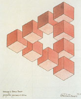
Figure 4
Oscar Reutersvärd, Hommage à Bruno Ernst, perspective japonaise nº 293 a,
Colored Drawing, 1934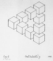
Figure 5
Oscar Reutersvärd, Opus 1 nº 293 aa, 1934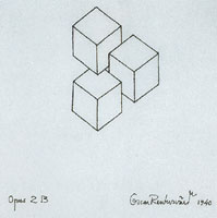
Figure 6
Oscar Reutersvärd, opus 2B, 1940
Step 2 Place blocks in position
Using SoftImage 3D modeling and animation software as a tool, we placed 21 red/blue/green blocks, following the pattern of the falling cubes in Duchamp’s poster (see Fig. 7A, a video computer animation of our 3D model of red/blue/green shaded cubes, and Fig. 7B an illustration of our 3D model cubes in the places determined by Duchamp chess poster blocks).
- click to see video animation
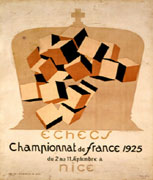
Figure 7A
The computer animation of 21 red/blue/green
shaded cubes following the pattern
of the falling cubes in Duchamp’s poster - click images to enlarge
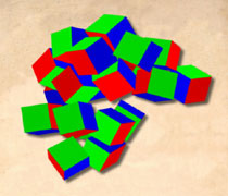
Figure 7B
An illustration of our 3D
model cubes in the places determined
by Duchamp chess poster blocks
Step 3 Note and then characterize the differences in ten locations
The striking difference in relationships among cubes that we immediately saw when we tried to arrange our red/blue/green blocks into Duchamp’s beige/pinkish brown/black cubes, pattern shows the necessity for imbedding the cubes into each other. With this new arrangement, the odd distortions in the original poster disappeared (see Fig. 8A &Fig.8B, a video animation that circles ten embedded locations and then magnifies the circled area, both in the original poster, and in our 3D model arrangement for making comparisons, and a still image that can be enlarged for study.)
-
click to see video animation
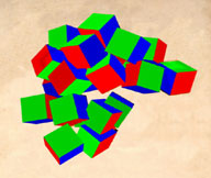
Figure 8A
A video animation that circles
ten embedded locations and then
magnifies the circled area,
both in the original poster,
and in our 3D model arrangement for comparisons -
Click to enlarge
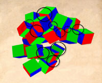
Figure 8B
A still image from the
video animation that can
be enlarged for study
Step 4 What Duchamp appears to be doing–hiding embedding points from the eye but not from the mind
click to enlarge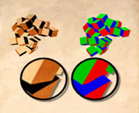
Figure 9A
Circled area comparison
of blocks 15 and 16 from
both Duchamp’s Chess Poster
and 3D model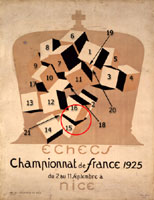
Figure 9B
Video animation for the
comparison of blocks 15
and 16 in Duchamp’s
Chess Poster and 3D model
click images to enlarge
click to enlarge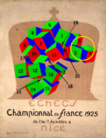
Figure 10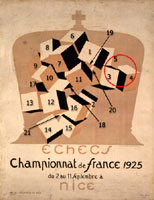
Figure 11
Our numbered diagrams of Duchamp’s
Chess Poster and of
our 3D model illustrate
specific alterations Duchamp
likely made which trick the eye
by use of false perspective cues
(cubes 15 and 16)
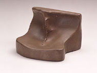
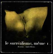
Refer to Figs. 9A and 9B, and to blocks 15 and 16, note the difference between the treatment of these two blocks in the original chess poster and our 3D model on the right. Block 15’s black top-surface in the original poster slices into cube 16 in the 3D model to the right. We learn from comparing Duchamp’s poster to our study model that to “hide” the embedding point of the right cube, Duchamp would only need to extend the brown square’s vertical lines, and to mirror the angle of the square’s top horizontal edge (Fig. 10). Duchamp repeats this approach throughout the poster, as revealed by our 3D model and animation sequence. Note cube 4 in Fig. 11, Cube 4’s top square has been extended and this indicates that the top of cube 4 was originally in front of cube 5 (as in the red/blue/green model now),whereas the final chess poster indicates that the top of cube 4 is behind cube 5. Duchamp’s creation of ambiguity in indicating which figure lies in front or in back represents an original variation upon other optical illusions. Duchamp himself had experimented with many sensory illusions, such as the convex/concave effect that switches back and forth in appearance–convex and near, to concave and therefore farther away. (Duchamp’s Female Fig Leaf and the cover of Surréalisme Même depict the same object.) However, one appears concave, which is the actual state of Duchamp’s object, whereas the convex image on the Journal cover is a retouched photograph with special lighting used to create the optical illusion that Duchamp’s concave object is convex (Figs.12A and B).
click images to enlarge
- Figure 12A
- Figure 12B
- Marcel Duchamp,
Female Fig Leaf, 1950 - Marcel Duchamp, Front cover of
Le Surréalisme, même I (1956)
click to enlarge
Figure 13
Numbered diagram of the
Poster for the Third
French Chess Championship (1925)
We found nothing in the literature of optical illusion that compares with Duchamp’s fascinating approach–that is, of actually embedding cubes together, and then altering them in slight but precise and systematic ways, so as to disguise his tamperings and fool our eyes into believing that several cubes are rationally seen behind others instead of in front (see cube 4 and 5), or that the cubes all have 90º angles (see cube 13) or equal straight edges (see cube 8), all in the same perspective view of one photograph. Partial cubes 18, 19, 20, and 21 were probably strategically placed in order to add to the overall instability of the eye and brain as they attempt to decipher the image. In particular, look at cube 8 and compare the angle and shape of the bottom square to the bigger front face. Note that the bottom edge is not parallel to the top edge above in the same square. Cube 8’s distortions cannot be attributed to a perspective rendering that matches any of the other cubes, or the overall scene (Fig. 13).
As in a baby’s game of peek-a-boo, where one comically switches from seeing with eyes to quick concealment (to what the mind can only see in memory or logic) Duchamp forces you to choose. Duchamp has only temporarily hidden the embedding points of the cube from our eyes (as our eyes accept and do not question his alterations of cubes into objects that are, in fact, no longer shaped like cubes). But he has not hidden this from our minds (which can move from intuition to measuring, and can rigorously detect departures of actual forms from ideal cubes).
Duchamp’s specific case of the Chess Poster, as its “deception” or optical illusion generally illustrates by direct experience, shows the failure of the retina to reveal reality or truth without the mind. (Philosophers from Helmholz to Thomas Kuhn have often used optical illusions as prototypical proofs for limitation of the eye and mind. In his Structure of Scientific Revolutions (1962), Thomas Kuhn famously refers to the content of revolutions in science, such as the change from a sun-centered solar system to an earth-centered cosmos, as both a mental and visual switch, as in our experience with optical illusions of gestalt figures. Kuhn essentially states that scientists who see only Rabbits before the revolution as in a Duck-Rabbit Gestalt figure will suddenly shift, in eye and mind, to seeing only Ducks in the very same places where only Rabbits were observed before (Fig.14). (5)
We believe that the ambiguous cubes in the Chess Poster represent more than Duchamp’s specific triumph in first creating a new class of optical illusion in 1925 (the phenomenon that only Penrose and Penrose later named in the 1950s). We suspect that Duchamp also viewed the creation of this poster as an experiment born of his larger and life-long enterprise in exploring “the beauty of the mind” or “grey matter”–especially as in used in chess, vs. the stupidity of using only the eye or “retina,” an approach that he often castigated.
click to enlarge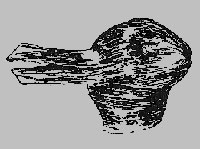
Figure 14
Duck-Rabbit Gestalt
In addition to his analogy of chess, Duchamp also claimed that allegorical art (that is,art before “retinal” impressionism) had embraced mental beauty in both the artist and the spectator, for he stated that both shared equally in the creative act. In allegorical art, patterns establish a visual language of forms imbued with universal meanings that are mentally encoded by the artist and then, in turn, must be decoded by the spectator’s mind and eye–a much different experience, Duchamp insists, than that offered by retinal art and sensations in visual experience alone.
Chess itself, by Duchamp’s analogy, is similar to allegorical art because pattern emerges from a set of rules (now as moves in the form of combinations, not as a language of visual forms). Instead of being encoded by the artist and then decoded by the spectator alone, as in allegorical art, chess patterns, also meaningless without a knowledge of rules, require the mind to see combinations of moves, including actions of the opponent, who co-creates moves from within the exchanges between players that emerge in the continual application of these rules, and who must also, just as the spectator does in art, also actively decode physical data into mental meaning.
Just as the shape of the duck/rabbit captures in time [albeit unstably] both a duck and rabbit, physical reality can only hold one belief at a time. (That is, it can be a duck or rabbit.) Duchamp, we believe, capitalizes on the additional possibilities within opticalillusions–for, as representations (as we understand from the 270º of the ambiguous triangle that we recognize as a triangle, but in the physical and Euclidean world would be restricted to 180º) they can be stretched beyond conventional meanings or rules, and even left without full (or even correct) explanation, only to be grasped later by creative acts in spectator’s minds. These spectators now see the chess poster as built from cleverly distorted cubes that stay (for a delay) below the threshold of detection in the very same physical positions where a “readymade” unaltered action photograph of falling regular cubes was seen before.
Step 5 Thinking it over: Could it be that Duchamp is just a bad draftsman?
Our conventional belief that Duchamp’s Chess Poster depicts a set of falling cubes was based upon his claim that he took a photo of falling cubes, and then used the chance positions to create his poster. The geometric shapes that we see in the 1925 poster, perhaps also abetted by the context of chess squares on a chess board, supported a belief that we were looking at multiple cubes, as Duchamp said. (6)
To answer a question with a question, we could ask: is it reasonable to believe that Duchamp’s lack of talent as a draftsman coincidentally led to a consistent and systemic mistake–in other words, that he drew distorted cubes that all happened to become undistorted real cubes when embedded into each other?
It seems to us more reasonable to assume that Duchamp’s various distortions–for example his changing a cube to overlapping in back instead of its correct frontal position–were all used to disguise embedded or intersecting planes.In other words, Duchamp challenges us with objects (in this case cubes) that can appear totally random and free in space, but actually are not, if one uses one’s mind to see. Shearer and Gould’s paper on Duchamp’s Three Standard Stoppages (1913-14) presents another case of Duchamp’s use of randomness as a decoy that must be questioned and tested before the real story and facts can be seen with the mind.
This issue of whether or not a phenomenon is, in fact, random remains an important topic in probability, even today. For example, we believe that a coin toss or a lottery is random. However, we can know with a great degree of certainty that the flip or number is not random if someone wins 100 times in a row.Randomness, in fact, is a matter of testing the facts before you, whether you deal with a coin, a roulette wheel or a photograph of chance “falling cubes.”
click to enlarge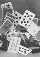
Figure 15A
O.R. Croy’s photo trick
uses playing cards to
create the illusion of random, falling objects.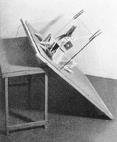
Figure 15B
What is not seen behind
the image of O.R. Croy’s photo trick
In “The Secrets of Trick Photography” by O.R. Croy, we found the following entry that reminds us of Duchamp’s falling cubes (Figs. 15A and 15B). Under the title “The things you don’t see,” this section suggests that photo tricks, such as those seen in fig.15A, create a puzzle “because the way in which they were taken is not obvious.” Croy continues: “It is consequently good to make puzzling pictures of this kind from time to time because it is just as much trouble and excellent practice to the photographer to think out ways and means as it is for the observer to find out how the work was done.” (7) Fig. 15B exposes the trick of 15A. Croy mentions that either a sheet of glass or black background with black thread will work to disguise the supporting structure that creates the illusion.
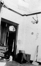
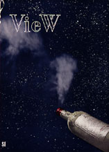
Duchamp often used trick photography from the 1910s throughout the rest of his life (see Figs. 16A and 16B, two trick photographs. Fig. 16A is from 1917, where Duchamp himself appears as a ghost figure, a typical and popular photo trick of that era. Fig. 16B is the 1945 View cover that Duchamp worked to create trick photographic effects. (Also recall the trick photo showing the Female Fig Leaf of 1950 as a convex figure).
- Figure 16A
- Figure 16B
- Studio photogaph (1916-17) appears to have a ghostly
figure of Duchamp,a common and popular photo trick at the time. - Cover of View magazine(1945) is a later example of Duchamp’s
use of trick photography in his work.
Step 6 Considering Alternative Hypotheses
We’ve all heard that if it looks like a duck, quacks like a duck, walks like a duck then it’s a duck. And yet Kuhn told the world that, even in factually based science, a duck can suddenly be seen, metaphorically speaking, as a rabbit. This seems to be a fundamental aspect of the
Click to see video animation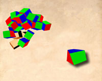
Figure 17
Video animation utilizing
irregular polyhedra shapes instead
of regular cubes to match with
the “cube-like”
shapes in the Chess Poster
creative act–the experience of a new factual reality emerging after discovery. Duchamp, throughout his career, promoted the notion that the spectator must play a 50% role in the creative act. Creating objects that instinctually included the shock of a challenge to factual reality, but that stayed in delay until spectators used their minds to see the mental beauty, seems consistent with Duchamp’s stated goals and purposes indeed.
Suppose however that Duchamp did not use actual cubes to create his poster, what would be the alternative?
We have a second experiment, seen in Fig. 17‘s video animation, where we take irregular polyhedra shapes instead of regular cubes, and then match what we see in the poster. (See Fig. 17‘s video animation that shows the amusing results.)
Notes
 1. Arturo Schwarz, Complete Works of Marcel Duchamp, revised and expanded paperback edition
(New York: Delano Greenidge Editions, 2000) 708.
 2. Francis M. Naumann, Marcel Duchamp: the Art of Making Art in the Age of Mechanical
Reproduction (Ghent, Amsterdam: Ludion Press, 1999) 101, 103.
 3. Rhonda R. Shearer, “Marcel Duchamp’s Impossible Bed and Other “Not” Readymade Objects:
A Possible Route of Influence From Art To Science,” Part I & II, Art and Academe 10,1 & 2 (Fall 1997; Fall 1998).
 4. Nigel Rodger, Incredible Optical Illusions: A Spectacular Journey through the World of the Impossible
(London: Quarto, Inc., 1998) 62.
 5. Thomas Kuhn, Structure of Scientific Revolutions (Chicago: University of Chicago Press, 1962).
 6. Arturo Schwarz, Complete Works of Marcel Duchamp (2000) 708.
 7. O.R. Croy, The Secrets of Trick Photography (Boston, MA: American Photographic Publishing Co., 1937) 128.
Figs. 1, 2, 4, 7A, 9B, 10, 11, 12A, 12B, 13, 16A, 16B
©2002 Succession Marcel Duchamp, ARS, N.Y./ADAGP, Paris. All rights reserved.
