The following article is published in two parts within the exhibition catalogue for “Aftershock: The Legacy of the Readymade in Post-War and Contemporary American Art,” Dickinson Roundell, Inc., New York, May – June 2003”
In a 1961 interview with Katherine Kuh, Marcel Duchamp, when asked about his readymades, let it be known that the concept behind those objects might be “the most important single idea to come out of my work.” In June 1967, the self-proclaimed “an-artist” – anticipating his final departure a mere sixteen months hence (“Quite simply, I am waiting for death”) – elaborated on his concept of the readymade: “Ultimately, it should not be looked at… It’s not the visual aspect of the Readymade that matters, it’s simply the fact that it exists.… Visuality is no longer a question: the Readymade is no longer visible, so to speak. It is completely gray matter. It is no longer retinal.” When pressed by his interviewer about the paradox of the readymades having “ended up being ‘consumed’ in museums and exhibitions, and sold as art objects” (particularly in light of the editions produced by the Galleria Schwarz in Milan in 1964), Duchamp replied:
“There is an absolute contradiction, but that is what is enjoyable, isn’t it? Bringing in the idea of contradiction, the notion of contradiction, which is something that has never really been used, you see? And all the more since this use doesn’t go very far. If you make an edition of eight Readymades, like a sculpture, like a Bourdelle or you name it, that is not overdoing it. There is something called “multiples,” that go up to hundred and fifty, two hundred copies. Now there I do object because that’s getting really too vulgar in a useless way, with things that could be interesting if they were seen by fewer people. There are too many people in this world looking. We have to reduce the number of people looking! But that’s another matter.”
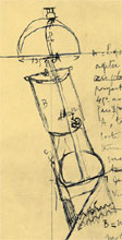
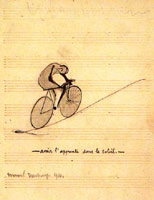
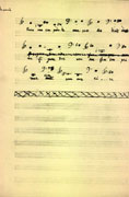
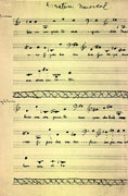
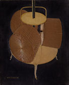
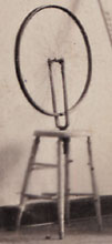
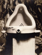
To “reduce the number of people looking” echoes an early note by Marcel Duchamp, “Limit the no. of rdymades yearly (?).” This comment, first published in the Green Box of 1934(Fig. 1), was most likely written between 1911 and 1915, during the period of the first readymades, such as the Bicycle Wheel (1913) (Fig. 2) and the Bottle Dryer (1914) (Fig. 3). As he was never keen on showing them publicly, early on they may have functioned as works of private contemplation (not unlike Descartes’ famous piece of wax or William of Occam’s razor), responses, perhaps, to his note of 1913: “Can one make works which are not works of ‘art’?” Accordingly, with the exception of one single New York exhibition in 1916, the readymades were unknown outside his small circle of friends and family until the 1940s. We should bear in mind that even the urinal entitled Fountain (Fig. 4) –– submitted not under Duchamp’s name, but under the pseudonym “R. Mutt” –– was rejected for display at the first exhibition of the Society of Independent Artists in 1917. Throughout his life Duchamp often declined to participate in exhibitions, especially when his readymades were involved. The Bicycle Wheel, for example, was not shown until 1951, and even then as a replica of the lost original. Duchamp is thus to be believed when he says that the readymades “were a very personal experiment that I had never intended to show to the public.”
click images to enlarge
-

Figure. 1
Marcel Duchamp, The Bride Stripped
Bare by Her Bachelors, Even (aka
the Green Box), 1934
-

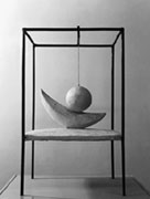
Figure.2
Marcel Duchamp, Bicycle Wheel, 1913
-

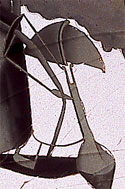
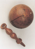
Figure. 3
Marcel Duchamp, Bottle Dryer, 1914
-

Figure. 4
Marcel Duchamp, Fountain, 1917
click to enlarge

Figure 5
Marcel Duchamp, Nude
Descending a Staircase, 1912
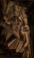
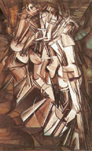
As for their actual number, Duchamp once spoke of thirty to thirty-five, though today only about a third of them are known. Many objects qualifying as readymades –– mentioned in his notes and in early accounts by Charles Sheeler, William Carlos Williams, and Edgar Varèse –– were never realized or are lost without a trace. In any case, their limited number, and the fact that at least a few of them are unaccounted for, strongly suggest that they were indeed the “personal experiment” that the an-artist described. Duchamp sought from the beginning to assure that his choice of objects would be limited in order to avoid redundancy, an inevitable consequence if a larger number of original readymades had been produced. In the 1930s Duchamp declined an offer from the Knoedler Gallery in New York, whose director offered him a substantial sum if he would continue to produce the works for which he was most famous (such as the Nude Descending a Staircase of 1912) (Fig. 5). “It would force me to repeat myself. I will not even envisage this possibility. I value my independence too much.” Despite the temptation, Duchamp kept the readymades out of the fray and, accordingly, they remained virtually unknown.
Duchamp’s refusal to have the readymades treated as works of art led him to claim that “for a period of thirty years nobody talked about them and neither did I.” His often-pronounced aesthetic indifference towards these objects also excluded the possibility of their appearance in large numbers, as that would have allowed for taste to infiltrate his “experiment.” In later years, to maintain this indifference despite their newly acquired fame, Duchamp –– always worried about the unavoidable aesthetics of patina –– thought of swapping them for newer mass-produced objects, replacing, for example, the Bottle Dryerwith a plastic bucket.
click to enlarge

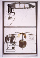
Figure 6
Marcel Duchamp,Boîte-en-Valise,
(open; edition started in 1941)
Outside of his notes in the Green Box, his private correspondence, and the miniatures and photographic reproductions in the Boîte-en-valise (which premiered in 1941) (Fig. 6), Duchamp did not publicly mention the readymades until 1945. In fact, the sole definition of the readymade published under Duchamp’s name, in 1938 –– “an ordinary object elevated to the dignity of a work of art by the mere choice of an artist” –– turns out not to have written by Duchamp but by André Breton.
All of the above can only hint at the intricacies of Duchamp’s early concept of the readymade and the many misreadings that followed. From the immediate post-war period until today, Duchamp’s readymades have been all too often taken as carte blanche for “anything goes,” mere nihilistic or iconoclastic gestures based on the belief that, generated by the choice of the artist, it is only the changing of the context (i.e. a urinal at a plumbing-fixture store vs. Fountain at a gallery) through which an ordinary object is transformed into a work of art. Misreading Duchamp of course, is what the ambivalent an-artist himself must have anticipated and, to a certain extent, encouraged, as Dieter Daniels observed:
Whenever other artists embrace the principle of the Readymade, the idea becomes completely detached from the historical objects and begins a life of its own. In so doing, it illustrates in the best way possible Duchamp’s dictum that it is the viewer who makes the pictures. The continued artistic influence of the Readymade may therefore be understood only as a permanent redefinition of its meaning.
Duchamp’s continuing fame, and his influence on a younger generation of artists, were unexpected: it took some time before it was established that “this whole bloody, revolutionary, contradictory century has basically been a big Duchampian-Beckettian burlesque.” His own attitude towards his heirs seemed to be, at best, one of aloofness (of the same sort he had earlier professed towards Dada and Surrealism), and, at worst, frustration, as was articulated to the Dadaist Hans Richter:
This Neo-Dada, which they call New Realism, Pop Art, Assemblage, etc., is an easy way out, and lives on what Dada did. When I discovered the ready-mades I sought to discourage aesthetics. In Neo-Dada they have taken my readymades and found aesthetic beauty in them, I threw the bottle-rack and the urinal into their faces as a challenge and now they admire them for their aesthetic beauty.
There is a problem with this infamous quote, however. Hans Richter asserted that it came straight from a letter written to him by Duchamp in 1961. Only years later did he admit that those words were not Duchamp’s. Richter had sent Duchamp this paragraph for comment, writing: “You threw the bottle rack and the urinal into their face…,” etc. Duchamp simply scrawled: “Ok, ça va très bien” into the margins.
In fact, the an-artist’s overall assessment of the new movements spreading all around him (and to which, to a certain degree, he owed his enormous renaissance) was, though disengaged, much more sympathetic than Richter’s misleading quote would suggest. In 1964, Duchamp, though unmoved by Pop artists’ sense of humor and choice of material, made the following favorable comments:
Pop Art is a return to “conceptual” painting, virtually abandoned, except by the Surrealists, since Courbet, in favor of retinal painting… If you take a Campbell soup can and repeat it 50 times, you are not interested in the retinal image. What interests you is the concept that wants to put 50 Campbell soup cans on a canvas.
From the 1950s on, Duchamp’s influence on the American art scene has grown precipitously. Beginning in 1942 he lived permanently in New York, and his presence was undoubtedly a factor in the numerous exhibitions that were held in this country in succeeding years. In 1952 Life magazine honored his continuing presence as “Dada’s Daddy” in a ten-page photo spread, and by the mid-50s some of his readymades were permanently installed in American museums. Robert Motherwell made a significant contribution toward a Duchamp renaissance with the publication of the anthology The Dada Painters and Poets (1951), in which he characterized the Bottle Rack as at once a “sculpture” and an “anti-art and consequently dada gesture,” concluding, “it is evident, thirty-five years later, that the bottle rack he chose has a more beautiful form than almost anything made, in 1914, as sculpture.” The game was on, and it certainly didn’t please everyone, least of all the Abstract Expressionists.
In 1957, Barnett Newman voiced his displeasure with the Whitney Museum of American Art, particularly with Robert Motherwell’s contribution to a catalogue for the memorial exhibition of Bradley Walker Tomlin. In a letter to John I. H. Baur, the Whitney’s director, Newman accused Motherwell of “smear and slander,” stating that he wanted to “make clear that if Motherwell wishes to make Marcel Duchamp a father, Duchamp is his father and not mine nor that of any American painter that I respect.” Four years earlier, in a similar tirade against the Museum of Modern Art, he had insinuated that Duchamp’s works in that institution merely added to its “popularizing role of entertainment,” and asserted “that the American public… seeks more from art than just gadgets.” In 1952, he confirmed that the “gadgets” of his scorn were indeed the readymades: “Marcel Duchamp tried to destroy art by pointing to the fountain, and we now have museums that show screwdrivers and automobiles and paintings. [The museums] have accepted this aesthetic position that there’s no way of knowing what is what.”
This was precisely the view of Clement Greenberg, the preeminent art critic of America’s post-war era. Greenberg attacked the tendency to produce art without the guidance of aesthetic judgment, a factor many artists wanted to do away with “in the hope, periodically renewed since Marcel Duchamp first acted on it fifty-odd years ago, that by dint of evading the reach of taste while yet remaining in the context of art, certain kinds of contrivances will achieve unique existence and value. So far, this hope has proved illusory.” With the advent of “Assemblage, Pop, Environment, Op, Kinetic, Erotic, and all the other varieties of Novelty Art” –– all movements, that is, which were more or less indebted to Duchamp – Greenberg bemoaned not only the passing of Abstract Expressionism but of “authentic art values.” These movements were fulfillments of “Duchamp’s dream of going ‘beyond’ the issue of artistic quality.” the “real failure of Pop art,” on top of its “easiness,” was its “vulnerability to qualitative comparisons,” something Duchamp had supposedly initiated in his “‘transcending’ the difference between good and bad in general.” It follows that at the heart of this confusion are the readymades in their three-dimensionality, a spatial “coordinate that art has to share with non-art.” That Greenberg saw the readymade as belonging to the history of painting rather than to that of sculpture clearly evolved from these observations.
On the other end of the spectrum, it was Duchamp himself who spoke out vividly against the movement heralded most by Greenberg:
The recent examples of Abstract Expressionism clearly show the ultimate in the retinal approach begun by Impressionism. By “retinal” I mean that the aesthetic pleasure depends almost entirely on the impression on the retina, without appealing to any auxiliary interpretation… The young artist of tomorrow will refuse to base his work on a philosophy as over-simplified as that of the “representative or non-representative” dilemma.
In the field of art theory, similar opposing voices made themselves heard. To give but one example: early on, New York’s young and infamous art critic Gene Swenson rejected the tradition that linked everything from Cubism to Color Field painting and instead proposed a different trajectory declaring Dada and Surrealism the ancestors of Pop. In 1966, he curated the exhibition “The Other Tradition” at the Philadelphia Institute of Contemporary Art. According to the catalogue, the show’s declared goal was “1) seeing certain twentieth-century works of art which have been overlooked or neglected by art historians, and 2) suggesting alternative intellectual’ rather than formal ways of dealing with this art.” Swenson’s checklist is topped off by four contributions from Duchamp, leading him to ask: “How much longer will we rest content with our defective and infectious critical tools and our academic standards? How many more times can we see the words ‘picture plane,’ ‘modernism,’ ‘crisis,’ new,’ and ‘literary’ without flushing?”
Swenson was reacting to a paradigmatic shift in American art, and many young artists were enthralled to find out that Duchamp’s newly discovered oeuvre spoke to their own strategies of subverting what came before them. He was simply “in the air,” as Bruce Nauman put it. John Cage began lecturing on Duchamp at Black Mountain College (starting in 1952) as well as at the New School of Social Research (1956-58), to a new generation of artists that included Robert Rauschenberg, George Brecht, Alan Kaprow, Al Hensen, Dick Higgins, and Jackson McLow. George Segal remarked that “Marcel Duchamp had a revived life through John Cage.” In 1958 Rauschenberg and Jasper Johns went to see the Duchamp collection at the Philadelphia Museum of Art. Years before, during the War years, Joseph Cornell had befriended Duchamp in the course of his collaboration on the latter’s Boîte-en-valise. Yet to comprehend fully the scope of Duchamp’s deep appreciation by post-war generation and contemporary American artists as well as the influence he wielded over them –– especially with his readymades –– nothing serves the purpose better than to hear it in their own words :
Robert Motherwell
“I would say that one of the most astonishing things in my lifetime as an artist is his prominence. Thirty years ago, if somebody had said to me, ‘he may become the major the major influence on the art scene,’ I’d have said: ‘You’re out of your mind,’ and most of my judgments were quite accurate then.”
– Vivien Raynor, “A Talk with Robert Motherwell,” Art News, vol. 73, no. 4 (April 1974). p. 51, quoted in: Dieter Daniels, “Marcel Duchamp: The Most Influential Artist of the 20thCentury?,” in: Museum Jean Tinguely Basel (ed.) Marcel Duchamp, Ostfildern: Hatje Cantz, 2002 [exh. cat.], pp. 37-40, pp. 25-33, p. 25.
Barnett Newman
I want particularly to make clear that if Motherwell wishes to make Marcel Duchamp a father, Duchamp is his father and not mine nor that of any American painter that I respect.”
– in a letter to John I. H. Baur, October 20, 1957, quoted in John P. O’Neill (ed.), Barnett Newman: Selected Writings and Interviews, New York: Alfred A. Knopf, 1990: p. 208.
George Segal
“Marcel Duchamp had a revived life through John Cage.”
– cited by Wouter Kotte, Marcel Duchamp als Zeitmaschine/Marcel Duchamp als Tijdmachine, Köln, Verlag der Buchhandlung Walter König, 1987: p. 86, n. 236.
John Cage
“It is astonishing how very much Marcel Duchamp makes others creative”
– cited by Serge Stauffer in: Thomas Zaunschirm, Bereites Mädchen Ready-made, Klagenfurt: Ritter, 1983, p. 10., quoted in: Marcel Duchamp: The Most Influential Artist of the 20th Century?,” p. 27.
“Say it’s not a Duchamp. Turn it over and it is.”
– “26 statements Re Duchamp” (1969), in: Susan Hapgood, Neo-Dada: Redefining Art 1958-62, New York: The American Federation of Arts, 1994 [exh. cat.], p. 137.
Nam June Paik
“Marcel Duchamp has already done everything there is to do – except video…only through video art can we get ahead of Marcel Duchamp.”
– interview with Irmeline Lebeer, in: Chroniques de l’art vivant, nr. 55 (February 1974), p. 35, quoted in: “Marcel Duchamp: The Most Influential Artist of the 20th Century?,” p. 27.
Robert Morris
“The Readymades are traditionally iconic art objects”
– “Notes on Sculpture 4: Beyond Objects” (1969), in: Charles Harrison and Paul Wood (eds.), Art in Theory: 1900-1990. An Anthology of Changing Ideas, Oxford and Cambridge, MA: 1992, vol. 2, p. 872, quoted in: “Marcel Duchamp: The Most Influential Artist of the 20th Century?,” p. 30.
Joseph Kosuth
The event that made conceivable the realization that it was possible to ‘speak another language’ and still make sense in art was Marcel Duchamp’s first unassisted Readymade. With the unassisted Readymade, art changed its focus from the form of the language to what was being said…This change – one from ‘appearance’ to ‘conception’ – was the beginning of ‘modern’ art and the beginning of conceptual art. All art (after Duchamp) is conceptual (in nature) because art only exists conceptually.”
– “Art after Philosophy” (1969), in: Art in Theory: 1900-1990. An Anthology of Changing Ideas, p. 844, quoted in: “Marcel Duchamp: The Most Influential Artist of the 20thCentury?,” p. 30.
Allan Kaprow
“[Duchamp] deliberately stopped making art objects in favor of little (ready-made) hints to the effect that you could pick up art anywhere you wanted. In other words, he implied that the whole business of art is quite arbitrary”
– “Interview with Allan Kaprow,” Allan Kaprow, Pasadena: Pasadena Art Museum, 1967 [exh. cat.], p. 8, quoted in: John Tancock, “The Influence of Marcel Duchamp,” in: Anne d’Harnoncourt and Kynaston McShine (eds.), Marcel Duchamp. A Retrospective Exhibition, Philadelphia: Philadelphia Museum of Art, 1973 [exh. cat.], pp. 160-178, p. 171.
“His readymades… are radically useful contributions to the current art scene. If a snow shovel becomes a work of art by simply calling it that, so is all of New York, so is the Vietnam war, so is a pedantic article on Marcel Duchamp… The Readymade is a paradigm of the way humans make and unmake culture. Better than ‘straight’ philosophy and social science, a good Readymade can ‘embody’ the ironic limits of the traditional theory that says reality is nothing but a projection of mind or minds. ”
– “Doctor MD”, in: “A Collective Portrait of Marcel Duchamp,” quoted in: Anne d’Harnoncourt and Kynaston McShine (eds.), Marcel Duchamp. A Retrospective Exhibition, Philadelphia: Philadelphia Museum of Art, 1973 [exh. cat.], pp. 204-205, p. 205.
“I think we all learned from… Duchamp. A key feature was discreetness, a timing and a restraint that many of us didn’t learn well enough. Duchamp was personally very helpful to us, no question… both practically and intellectually.”
– interview with Susan Hapgood, quoted in: Neo-Dada: Redefining Art 1958-62, p. 116.
Vito Acconci
“Did this film [Conversions of 1971] record a process parallel to the multivalence between Marcel Duchamp and Rrose Sélavy? ”
“Yes. ”
– interview with Robert Pincus Witten, “Vito Acconci and the Conceptual Performance,” in Artforum, vol. 10, nr. 8 (April 1972), p. 49, quoted in: John Tancock, “The Influence of Marcel Duchamp,” p. 178.
William T. Wiley
“What we can learn from Marcel Duchamp is the same message from any artist who has made his presence manifest in the form of personal achievement: is essentially that we do not have to follow his example. Yet should we find in his example a path that interests us we should trust ourselves enough to follow that path as long as it is possible without an overabundance of human misery”
– “Thoughts on Marcel Duchamp,” in: Brenda Richardson, Wizdumb: William T. Wiley, Berkeley: University Art Museum, 1971, p. 42, quoted in: “The Influence of Marcel Duchamp,” p. 173.
Paul Pfeiffer
“Somewhere I read a statement by Duchamp to the effect that his art was intended as a destroyer, specifically of identity. I find that really inspiring. Putting a mustache on Mona Lisa makes a pretty basic point about the fluidity of identity and the depths to which gender, race and nationality are encoded into vision. I’m interested in multiple meanings and a kind of ambiguity that frustrates any attempt to pin it down.”
– Linda Yablonsky, “Making Microart that can Suggest Macrotruths,” in: The New York Times, December 9, 2001, p. 39.
Richard Pettibone
“My response to Duchamp hasn’t changed at all in the last 34 years. His work is just as beautiful. Being a visual artist I feel that it’s very important what things look like & in spite of all that talk about chance & giving up taste, etc. Duchamp’s work is still drop dead gorgeous.”
– letter to Francis M. Naumann, August 1997, quoted in: Francis M. Naumann, Apropos of Marcel. The Art of Making Art after Duchamp in the Age of Mechanical Reproduction, New York: Curt Marcus Gallery, 1999 [exh. cat.], p. 13.
Sanford Biggers
“Duchamp’s readymades are now aesthetically and formally pleasing, though they were controversial for their time and opposed the conventions… I also follow the idea of keeping the form as one of the most important elements but also feel strongly about challenging prescribed notions in art theory. The fact that I am the creator or author of these pieces also adds to how these pieces are interpreted by art theory.”
– Lauren Wilcox, “ Transformation and Tradition: Interview with Sanford Biggers,” in:Tout-Fait: The Marcel Duchamp Studies Online Journal, vol. 2, nr. 4, Art & Literature (January 2002)
Elaine Sturtevant
“[Duchamp’s] concern with trying to redefine what we consider art was a very big factor in terms of my own work.”
– Francis M. Naumann, Apropos of Marcel. The Art of Making Art after Duchamp in the Age of Mechanical Reproduction, New York: Curt Marcus Gallery, 1999 [exh. cat.], p. 22.
Claes Oldenburg
“[Duchamp] was certainly on the scene. But I believe that the sort of thing I was into, which really was about the very gritty aspects of the Lower East Side, was very remote from Duchamp.”
– interview with Susan Hapgood, in: Neo-Dada: Redefining Art 1958-62, p. 124.
“Yes, he was a historical figure.”
– interview with Benjamin H. D. Buchloh (1985), quoted in: Martha Buskirk and Mignon Nixon (eds.), The Duchamp Effect. Essays, Interviews, Round Table. Cambridge, MA: MIT/October, 1996, pp. 33-36, p. 33. [(originally published as “Three Conversations in 1985: Claes Oldenburg, Andy Warhol, Robert Morris,” in: October 70 (Fall 1994).]
George Brecht
“The difference between a chair by Duchamp and one of my chairs could be that Duchamp’s chair is on a pedestal and mine can still be used.”
– Henry Martin, An Introduction to George Brecht’s Book on the Tumbler on Fire, Milan: Multhipla Edizioni, 1978, p. 71, quoted in: Neo-Dada: Redefining Art 1958-62, p. 27.
“I read somewhere, quite a while ago, that an interviewer asked: “How does it feel now, Mr. Duchamp, that everyone knows your name?” And Duchamp answered, “My grocer doesn’t.”
– “Notes on the Inevitable Relationship GB-MD (If there is one)” (1973), quoted in: Anthony Hill (ed.), Duchamp: Passim. A Marcel Duchamp Anthology, Langhorne, PA: G+B Arts International, 1994, p. 167.
Andy Warhol
“Well, yeah, we saw him a lot, a little bit. He was around. I didn’t know he was that famous or anything.”
– interview with Benjamin H. D. Buchloh (1985), in: The Duchamp Effect. Essays, Interviews, Round Table., pp. 37-45, p. 37.
Jasper Johns
“Duchamp’s wit and high common sense (“Limit the no. of rdymades yearly”), the mind slapping at thoughtless values (“Use a Rembrandt as an ironing board”), his brilliantly inventive questioning of visual, mental and verbal focus and order (the beautiful Wilson-Lincoln system, which was never added to the glass; ‘lose the possibility of identifying … 2 colors, 2 laces, 2 hats, 2 forms’; the vision of an alphabet ‘only suitable for the description of this picture’) inform and brighten the whole of [the Green Box].”
– “The Green Box,” Scrap (December 23, 1960), p. 4, in: Joseph Masheck (ed.), Marcel Duchamp in Perspective, Englewood Cliffs, NJ: Prentice-Hall, 1975, p. 111.
“Marcel Duchamp, one of this century’s pioneer artists, moved his work through the retinal boundaries which had been established which had been established with Impressionism into a field where language, thought and vision act upon another.… The art community feels Duchamp’s presence and his absence. He has changed the condition of being here.”
– “Marcel Duchamp (1887-1968),” Artforum, vol. VII, nr. 3 (November 1968), p. 6, in:Marcel Duchamp in Perspective, 1975, p. 147.
“The ready-made was moved mentally and, later, physically into a place previously occupied by the work of art.”
– quoted in Wouter Kotte, Marcel Duchamp als Zeitmaschine/Marcel Duchamp als Tijdmachine, Köln: Verlag der Buchhandlung Walter König, 1987, p. 84 (footnote 203).
Donald Judd
“Duchamp invented several fires but unfortunately didn’t bother with them.… The work Duchamp does have is of course highly interesting, but it’s a mistake not to have developed it. His work and his historical importance are different things. It’s to other people’s credit to have developed his or related ideas… The roto-reliefs and the ready-mades and assisted ready-mades are fine.”
– “Marcel Duchamp and/or Rrose Sélavy,” Arts Magazine, vol. XXXIX, nr. 6 (March 1965), pp. 53-54, in: Marcel Duchamp in Perspective, p. 121.
Robert Smithson
“I see Duchamp as a kind of priest of a certain sort. He was turning a urinal into a baptismal front… In other words, a Readymade doesn’t offer any kind of engagement. Once again it is the alienated relic of our modern postindustrial society. But he is just using manufactured goods, transforming them into gold and mystifying them.
– Moira Roth, “Robert Smithson, an Interview”, Artforum, vol. XII, nr. 2 (October 1973), p. 47, in: Marcel Duchamp in Perspective, pp. 134-137, p. 136.
William N. Copley
“If Marcel Duchamp ever died, his phoenix Rrose Sélavy lifted herself from the remains of the past that the former had desecrated by putting an ink-moustache on the Mona Lisa, thus creating a present for himself and all of us in which nouns like ‘art’ and ‘poetry’ melt into a single word.”
– “Art is not Furniture”, in: Alfred M. Fischer and Dieter Daniels (eds.), Übrigens Sterben Immer die Anderen. Marcel Duchamp und die Avantgarde seit 1950, Köln: Museum Ludwig, 1987 [exh. cat.], p. 283 (translated from the German).
Mike Bidlo
“Many artists have spent significant energies exploring his legacy”
– The Fountain Drawings, Zurich/New York: Bischofberger/Shafrazi, 1998 [exh. cat.], p. 54.
Joseph Cornell
“I believe that surrealism has healthier possibilities than have been developed. The constructions of Marcel Duchamp who the surrealists themselves acknowledge bear out this thought, I believe.”
– letter to Alfred Barr, 13 November 1936, quoted in: Anne Temkin, “Habitat for a Dossier,” in: Polly Koch (ed.), Joseph Cornell/Marcel Duchamp…in resonance, Ostfildern: Hatje Cantz, 1999 [exh. cat.], pp. 79-93, p. 87.
Robert Rauschenberg
“[Duchamp’s] recognition of the lack of art in art and the artfulness of everything, I think, is probably his most important contribution.”
– transcribed from the film Rebel Ready-Made: Marcel Duchamp (BBC, June 23, 1966), quoted in: Francis M. Naumann, Marcel Duchamp. The Art of Making Art in the Age of Mechanical Reproduction, New York: Abrams, 1999, p. 294.
“Marcel Duchamp is all but impossible to write about. Anything you may say about him is at the same time untrue, but when I think of him I get a sweet taste in my body.”
– “A Collective Portrait of Marcel Duchamp,” p. 217.
Yoko Ono
“drink an orange juice laced with
sunshine and spring and you’ll see Duchamp.”
– “A Collective Portrait of Marcel Duchamp,” p. 215.
Jason Rhoades
“Duchamp for me is like L. Ron Hubbard. He’s a slippery figure who keeps popping up.”
– Russell Ferguson, “Given: 1. The Caprice, 2. The Ferrari,” in: Parkett, No. 58 (2000), pp. 122-125, p. 123.
Hannah Wilke
“To honor Duchamp is to oppose him… The issue that remains, was Duchamp trying to control his own death by killing art while he was still alive – aesthetic impotence for the sake of survival… Objecting to art as commodity is an honorable occupation that most women find it impossible to afford. Is this ready maid, having collected many of the readymades now in Oldenburg’s Ray Gun Wing owned by Peter Ludwig, owed an equal share for her part in the collaboration? Could commodities but speak, they would say; Our use, value may be a thing that interests men… In the eyes of each other we are nothing but exchange values.”
– “I Object. Memoirs of a Sugar Giver”, in: Übrigens Sterben Immer die Anderen. Marcel Duchamp und die Avantgarde seit 1950, pp. 263-271, pp. 269,270.
Arakawa & Madeline Gins
Managing to position objects to hold their own in relation to that which ubiquitously happens along and even to redirect it, using very-adjusted and less-adjusted ready-madeinsertions into symbolizing power, an inchoate emanating-out ready-made in its own right, to convey and express enough and more than enough, M. D. changed the history of expression (read symbolizing) and redefined (artistic) purpose — two remarkable achievements.
– e-mail to the author, February 7, 2003.
Ed Ruscha
“If [Duchamp] hadn’t come along, we would have needed to invent him.”
– interview with Robert L. Pincus, October 30, 1990, in: Robert L. Pincus,” ‘Quality Material…’: Duchamp Disseminated in the Sixties and Seventies,” in: Bonnie Clearwater (ed.), West Coast Duchamp, Miami Beach: Grassfield Press, 1991, pp. 87-101, p. 100.
“What do you think is Duchamp’s most significant contribution?”
“That he discovered common objects and showed you could make art out of them.”
– interview with Elizabeth Armstrong, June 17, 1994, in: The Duchamp Effect. Essays, Interviews, Round Table., pp. 55-56, p. 55.
Bruce Connor
“I still feel that he dealt with enigmas and arbitrariness in the world with a sharp analytical mind.”
– interview with Elizabeth Armstrong, June 9, 1994, in: The Duchamp Effect. Essays, Interviews, Round Table., pp. 57-59, p. 57.
Vija Celmins
“I was greatly influenced by Duchamp, if only indirectly, by questioning what painting is – and should be.”
– interview with Robert L. Pincus, March 26, 1991, in: ‘Quality Material…’: Duchamp Disseminated in the Sixties and Seventies,” p. 88.
Sherrie Levine
“I was very surprised when I saw my first Fountain. When I made the decision to cast the urinal, I was thinking primarily about Duchamp, but the finished high polish bronze sculpture more readily evoked Brancusi.”
– interview with Martha Buskirk, May 13, 1994, in: The Duchamp Effect. Essays, Interviews, Round Table., pp. 177- 181, p. 179.
Louise Lawler
“[T]o me, Duchamp signaled a ‘bottle rack’ (who uses that?), a weird looking urinal, and a lot of pictures of him smoking and enjoying the sun with other people.…]n fact, all the readymades are interesting-looking things now, and their normalcy is gone. …This discussion of Duchamp seems a good opportunity to express my discomfort with too much referencing of authority that is restrictive, rather than enjoying the work’s ‘kindling’ effect and use.”
– interview with Martha Buskirk, May 20, 1994, in: The Duchamp Effect. Essays, Interviews, Round Table., pp. 183- 186, pp. 183, 186.
“Duchamp’s fetishization gets on my nerves.”
– e-mail to the author, February 2, 2003.
Chris Burden
“He was definitely a formative figure for me… In an age of Cal Arts and Jeff Koons, Duchamp is a different role model”
– interview with Robert L. Pincus, September 26, 1990, in: “ ‘Quality Material…’: Duchamp Disseminated in the Sixties and Seventies,” pp. 98, 100.
John Baldessari
“There is a serious unseriousness going on… I see a kinship there, I feel I understand what [Duchamp’s] about.”
-interview with Moira Roth, January 6, 1973, in: ‘Quality Material…’: Duchamp Disseminated in the Sixties and Seventies,” p. 88.
Clyfford Still
“Few men could better exemplify the antithesis of my work than Marcel Duchamp.”
– “Letter to the Editor,” Artforum (February 1964), quoted in Calvin Tomkins, Duchamp. A Biography, New York: Henry Holt, 1996, p. 438.
William de Kooning
“And then there is that one-man movement, Marcel Duchamp – for me a truly modern movement because it implies that each artist can do what he thinks he ought to – a movement for each person and open for everybody.—”
– “What Abstract Art Means to Me,” Museum of Modern Art Bulletin, vol. 18, nr. 3 (June 1951), p. 7.
Shigeko Kubota
“Are we dancing still on the gigantic palm of Duchamp, thinking it is a big continent and ocean?”
– “Twenty Questions About My Work,” quoted in: Zdenek Felix (ed.), Shigeko Kubota. Video Sculptures, 1981 [exh. cat.], p. 51.
Jeff Koons
“You can look at Marcel Duchamp… Everything comes back to the ability of the artist to be able to communicate, to focus.
– “Jeff Koons. I have my finger on the eternal,” interview with Andrew Renton, in: Flash Art, vol. XXIII, nr. 153 (Summer 1990), pp. 110-115, quoted in: Thomas Zaunschirm, Kunst als Sündenfall. Die Tabuverletzungen des Jeff Koons, Freiburg: Rombach, 1996, pp. 7-20, p. 16.
“My process of distancing myself from subjective art continued through the late ‘70’s, which included exposure to Marcel Duchamp. He seemed the total opposite of the subjective art I had been immersed in. It was the most objective statement possible, the readymade. I loved that aspect and started doing my first inflatables.”
– interview with Alan Jones, in: Temaceleste, nr. 88 (November/December 2001), pp. 34-39, p. 36.
Bruce Naumann
“The kind of questions important to Duchamp were absorbed and circulated. Many people dealt with them and thought about them. In this regard he certainly was an influence.”
– interview with Lorraine Sciarra (1972), quoted in: Christine Hoffmann (ed.), Bruce Nauman. Interviews 1967-1988, Amsterdam: Verlag der Kunst, 1966, pp. 66-87, p. 69 (translated from the German).
“He leads to everybody and nobody”.
– “A Collective Portrait of Marcel Duchamp,” p. 211.
It is obvious what Barry Schwabsky meant when he reviewed the Arturo Schwarz’s revised edition of The Complete Works of Marcel Duchamp in 2001: “Duchamp’s work is so deeply encoded in the fabric of contemporary art that I’m tempted to keep this book not with other art monographs, but on the ready-reference shelf next to Roget, Bartlett, and Merriam-Webster: Duchamp is to a great extent, our vocabulary.” The an-artist quickly had become the Über-father par excellence, creating an anxiety of influence some felt was too overpowering. Particularly within the American context.
Duchamp’s significance as originating father is generally seen to be identical to the significance of the readymades in relation to postmodernism. As paternal, theological origin, Duchamp is the readymades and the “readymades Duchamp” comes to signify postmodernism.… Duchamp has become a powerful authorizing function by which works produced by contemporary artists claim nepotistic validation as begotten by the Duchampian seed.
Today, with the concept of irony co-opted and empty gestures of shocking for shock’s sake held in high regard (with no one within the art world ever offended), many artistic strategies add up to nothing more than a “conformity of refusal.” Could it be that the readymade – just one decade short of its 100th birthday – is finally losing its disruptive potential? Maybe so, if its concept is only interpreted as an excuse for “anything goes” or the mere provocative gesture declaring anything to be art via a change of context. Duchamp himself had already noticed as much when he allowed his readymades to be turned into an edition precisely at that moment in the early 1960s when they had become celebrated icons and art-world commodities. Nowadays, it is not enough simply to appropriate formally the an-artist’s work. Every artist borrowing Duchamp’s highly charged visual vocabulary walks a fine line between creating a token pastiche (an art-world inside joke based solely on recognizing affinities) and intellectually engaging the ideas surrounding the work.
Duchamp –– except for his fleeting fame at the Armory Show of 1913, caused by the succès de scandale of the Nude Descending a Staircase–– had the luxury of being unrecognized as a major artistic force until he had reached his sixties. Left to himself, far away from the spotlight and thus from any system’s intricacies of interdependence, he could proclaim himself to be nothing but a “breather,” being mostly (and somewhat wrongfully) known for having abandoned all artistic activity from the mid-20’s on. Besides his many artist friends and a few wealthy patrons, Duchamp lived completely detached from the art world as we know it. He carefully kept himself independent, seeing to it personally that his works would end up grouped together with a few collectors and museums. Later in life, Duchamp thought the contemporary art market responsible for the impossibility of young artists truly to concentrate on what they were doing. He came to lament the perpetually increasing tide of attention, of dealers, galleries, collectors, critics, and exhibitions, turning art into an “over-developed exoteric”:
By that I mean that the general public accepts and demands too much from art, far too much from art; that the general public today seeks aesthetic satisfaction wrapped up in a set of material and speculative values and is drawing artistic output towards an enormous dilution.
This enormous dilution, losing in quality what it gains in quantity, is accompanied by a leveling down of present taste and its immediate result will be to shroud the near future in mediocrity.
In conclusion, I hope that this mediocrity, conditioned by too many factors foreign to art per se, will this time bring a revolution on the ascetic level, of which the general public will not even be aware and which only a few initiates will develop on the fringe of a world blinded by economic fireworks. The great artist of tomorrow will go underground.
Underground, the artist would examine whole new ways of expression to subvert the overall status quo of the art world in all of its wide-ranging aspects. In a 1922 survey by Alfred Stieglitz regarding the status of photography as a form of art, Duchamp had answered: “You know exactly how I feel about photography. I would like to see it make people despise painting until something else will make photography unbearable. There we are.” Today, installation and video art are ever on the rise, figurative painting yet again en vogue (with often surprising results), and the idea of a single work of art often substituted for the impact of a whole group of them or an environment. More than ever, artists “on the fringe” (geographically and ethnically) make themselves heard. As a critique of biotechnology, some artists are using new materials such as DNA, treating the body as a readymade.
click to enlarge


Figure 8
Marcel Duchamp, Étant Donnés(inside
and outside view), 1946-1966
It remains to be seen how these strategies will eventually play out. An interesting aspect pertaining to Duchamp’s oeuvre is a renewed interest in his last major work,Given: 1. The Waterfall, 2. The Illuminating Gas (1946-1966) (Fig. 8), Étant Donnés for short. in a recent interview, Björk, Iceland’s Queen of Pop, declaring Duchamp a “genius,” expressing awe for the Étant Donnés: “And then he created an artwork, when he was already very old, when everyone thought he’d already be over with, and this artwork changed completely the 20th century.” For the New York photographer Gregory Crewdson, “it’s extraordinarily photographic, to the point of looking through an aperture at a frozen moment in time. It’s everything I want from an art piece. It’s haunting, mysterious, troubling, beautiful, heightened, disturbing.” Looking through two peepholes drilled at eyelevel into a massive wooden door in a separate room at the Philadelphia Museum of Art, the viewer becomes aware of a 3-D multimedia assemblage depicting the partly hidden body of nude woman (with a prominently displayed, shaved vulva) lying on a bed of twigs and clutching a gas burner in front of a trompe l’oeil landscape with a running waterfall and clouds made of cotton. Duchamp had secretly worked on Étant Donnés for twenty years. It was revealed only after his death in the summer of 1969. After seeing the an-artist’s last work, Hannah Wilke, another artist greatly inspired by him, asked: “Did Dr. Duchamp (MD) disguise with dignity or despair the destruction, degeneration, and denigration of the maimed model of mortality – Mother?” Since Socrates, asking questions often proves more beneficial and generates more creative energy than trying to provide that one right answer. Duchamp himself was not always right, of course. In 1961, for example, he predicted that “in five or six years, no one would talk about [the readymade] anymore.” Throughout his late interviews in the sixties, he often pointed out that he was mostly interested in an audience fifty or a hundred years hence. Thirty-five years after his death, that audience is ever-growing.
Notes
* Parts of this essay were presented as a lecture entitled “Marcel Duchamp, Stephen Jay Gould and the End of ‘Anything Goes’,” on 15 June 2002, on the occasion of a symposium held during the run of a Duchamp exhibition at the Museum Jean Tinguely, Basel, Switzerland. I thank Francis M. Naumann for suggesting the title, drawing my attention to various sources and providing copies of some articles while my Duchamp library was being shipped from New York to Munich.
1. Katharine Kuh, The Artist’s Voice: Talks with Seventeen Artists, New York, Harper & Row, 1962: p. 92.
2. In a 1959 interview, Duchamp coined the sobriquet “an-artist” for himself, a pun on anarchist – while dismissing the term “anti-artist” as someone who would depend on his opposite too much in order to exist (and would thus still be as much of an artist as the one without the prefix “anti-“); from an an interview with George Heard Hamilton and Richard Hamilton, “Marcel Duchamp Speaks,” BBC – Third Program (series: Art, Anti-Art, ca. October 1959); issued as an audio tape by William Furlong (ed.), Audio Arts Magazine, vol. 2, nr. 4, 1976 (London). I thank André Gervais for providing me with the source of Duchamp’s first mention of “an-artist.”
3. “Marcel Duchamp Talking about Readymades” (Interview by Phillipe Collin, 21 June 1967), in Museum Jean Tinguely, Basel (ed.), Marcel Duchamp, Ostfildern: Hatje Cantz, 2002 [exh. cat.]: pp. 37-40.
4. Michel Sanouillet and Elmer Peterson (eds.), The Writings of Marcel Duchamp, New York, Da Capo, 1989, p. 33.
5. In his Marcel Duchamp. The Art of Making Art in the Age of Mechanical Reproduction (New York, Abrams, 1999) Francis M. Naumann differentiates between “assisted readymade,” “imitated rectified readymade,” “ printed readymade,” “ readymade (or ready-made),” “ rectified readymade,” and “semi-readymade” (pp. 308-309), not to mention the “reciprocal readymade,” as discussed in one of Duchamp’s notes in his Green Box: “Use a Rembrandt as an Ironing Board,” (in The Writings of Marcel Duchamp, p. 32), a remark that may well have inspired Robert Rauschenberg to do his Erased de Kooning (1953) and Jasper Johns to use Duchamp’s small bronze Female Fig Leaf for a surface imprint (albeit almost undetectable) on his painting No (1961). Throughout this essay, I concern myself with the “unassisted readymade.”
6. Naumann 1999, p. 74.
7. Anonymous, “Artist Marcel Duchamp Visits U-classes, Exhibits at Walker,” Minnesota Daily, 22 October 1965.
8. Dieter Daniels, Duchamp und die Anderen. Der Modelfall einer künstlerischen Wirkungsgeschichte in der Moderne, Köln: DuMont, 1992, p. 205.
9. Duchamp, cited in Arturo Schwarz, The Complete Works of Marcel Duchamp, New York: Delano Greenidge, 2000, p. 68.
10. “Marcel Duchamp Talking about Readymades,” interview with collin, 1967, p. 40.
11. Werner Spies, Max Ernst, Collagen, Köln: 1988, p. 23.
12. It has been argued that only with their documentation within the Boîte -en-Valise did Duchamp take the significant step of both defining the readymades as a clearly defined group of works (deciding which ones he would include when starting to work on the Boîte around 1936) and placing them within the context of art (Duchamp und die Anderen. Der Modelfall einer künstlerischen Wirkungsgeschichte in der Moderne, p. 217).
13. Hector Obalk, “The Unfindable Readymade,” in: Tout-Fait: The Marcel Duchamp Studies Online Journal, vol. 1, no. 2, (Articles)
14. Hector Obalk, “The Unfindable Readymade,” (as confirmed by André Gervais).
15. George Dickie, Art and the Aesthetic. An Institutional Analysis, Ithaca and London, Cornell UP, 1974: pp. 38-39.
16. Dieter Daniels, “Marcel Duchamp: The Most Influential Artist of the 20th Century?,” in Museum Jean Tinguely Basel (ed.), Marcel Duchamp: p. 29.
17. Brooks Adams “Like Smoke: A Duchampian Legacy,” in: Christos M. Joachemides and Norman Rosenthal, eds., The Age of Modernism. Art in the 20th Century, Ostfildern: Hatje, 1997 [exh. cat.], p. 321. In this regard, see also Pontus Hulten’s remark (in Pontus Hulten, ed., Marcel Duchamp, Milano: Bompiani, 1993 [exh. cat.], p. 19): “ If, in 1953, somebody had said that forty years later [Duchamp’s] work would be considered more important than Picasso’s, that person would have been looked on as a madman. Et pourtant…”
18. Duchamp, in Hans Richter, Dada: Art and Anti-Art, New York, McGraw Hill, 1965: pp. 207-208.
19. Hans Richter, Begegnungen von Dada bis Heute, Köln, DuMont: pp. 155ff.
20. Rosalind Constable, “New York’s Avant-garde, and How It Got There,” cited in Jennifer Gough-Cooper and Jacques Caumont, “Ephemerides on and about Marcel Duchamp and Rrose Sélavy, 1887-1968,” in Pontus Hulten, ed., Marcel Duchamp, Cambridge, MIT Press, 1993, entry for May 17, 1964.
21. Among the important shows of Duchamp’s work in the late 40s and early 50s were those at the Sidney Janis Gallery, the Rose Fried Gallery, and the Julien Levy Gallery, New York, as well as various exhibitions at the Yale University Art Gallery. Peggy Guggenheim’s Art of this Century was already displaying his works in the early 40s, and in 1957, the Guggenheim Museum launched a major travel exhibition of the three Duchamp brothers, entitled “Jacques Villon, Raymond Duchamp-Villon, Marcel Duchamp.”
22. Sargeant Winthrop, “Dada’s Daddy: A New Tribute is Paid to Duchamp, Pioneer of Nonsense and Nihilism,” in: Life, vol. 32, no. 17 ( 28 March 1952): pp. 100-110.
23. Robert Motherwell, ed., The Dada Painters and Poets. An Anthology, Cambridge: Belknap/Harvard University Press, 1989: xxiii. Other significant English-language publications on Duchamp before 1960 include Marcel Duchamp: From the Green Box (New Haven, The Readymade Press, 1957; 25 notes translated by George Heard Hamilton and published in an edition of 400), Robert Lebel’s widely available monograph Marcel Duchamp (New York, Grove Press, 1959), and Richard Hamilton’s typographic version of all of the Green Box notes in The Bride Stripped Bare by her Bachelors, Even (London and Bradford, Percy Lund, Humphries & Co., and New York, George Wittenborn, 1960).
24. Newman, in John P. O’Neill (ed.), Barnett Newman: Selected Writings and Interviews, New York: Alfred A. Knopf, 1990: p. 208.
25. Newman, in O’Neill 1990: p. 39.
26. Newman, in O’Neill 1990: p, 247. Newman went on to suggest that MoMA should “put on an exhibition of machine guns.” It bears notice that in September 1999, when the New York gallery owner Mary Boone presented Tom Sach’s “Haute Bricolage,” in which firearm paraphernalia were displayed and 9-millimeter bullets were placed in a bowl for visitors to take home, she was briefly arrested by the police for the illegal distribution of live ammunition.
27. Greenberg, “Avant-Garde Attitudes: New Art in the Sixties,” in John O’Brian, ed., Clement Greenberg: The Collected Essays and Criticism, vol. 4., Chicago and London: The University of Chicago Press, 1993, p. 293.
28. Clement Greenberg, “Recentness of Sculpture,” in O’Brian 1993, p. 252.
29. Donald B. Kuspit, Clement Greenberg: Art Critic, Madison: The university of Wisconsin Press, 1979, p. 114.
30. Greenberg, “Avant-Garde Attitudes: New Art in the Sixties,” in O’Brian 1993: pp. 301-2.
31. Clement Greenberg, “Recentness of Sculpture,” in O’Brian 1993: p. 254.
32. See Thierry de Duve, Clement Greenberg: Between the Lines, Paris: Dis Voir, 1996 as well as hisRésonances du Readymade, Nîmes 1989, p. 132 (referred to in Dieter Daniels, “Marcel Duchamp: The Most Influential Artist of the 20th Century?,” p. 31.)
33. Marcel Duchamp, “Where Do We Go From Here?,” address to a symposium at the Philadelphia Museum College of Art, March 1961, in Anthony Hill, ed., Duchamp: Passim. A Marcel Duchamp Anthology, Langhorne, PA: G+B Arts International, 1994, p. 89. Duchamp seems to have had an unfavorable opinion of Abstract Expressionism’s major player, Jackson Pollock. According to Thomas B. Hess, Duchamp “complained” to him that Pollock “still uses paint, and we finished that… [Pollock] never will enter the Pantheon!” (Hess, “J’accuse Marcel Duchamp,” in Joseph Masheck, ed., Marcel Duchamp in Perspective, Englewood Cliffs, Prentice-Hall, 1975: p. 120). Duchamp had declared painting dead with his last oil on canvas, Tu m’ from 1918. In regard to Pollock, there is yet another anecdote worth telling: In 1945, Peggy Guggenheim called in Duchamp and David Hare to deal with a crisis involving a twenty-foot-long mural by Pollock. The mural was too long for the space it had been commissioned to fill, in the entrance hall of Guggenheim’s apartment. Duchamp coolly advised cutting eight inches off one end. According to Hare, “Duchamp said that in this type of painting it wasn’t needed” (Calvin Tomkins, Duchamp: A Biography, New York, Henry Holt, 1996: p. 362).
34. Scott Rothkopf, “Banned and Determined,” in Artforum, vol. 40, no. 10 (Summer 2002): p. 144.
35. John Tancock, “The Influence of Marcel Duchamp,” in Anne d’Harnoncourt and Kynaston McShine, eds.,Marcel Duchamp. A Retrospective Exhibition [exh. cat.], Philadelphia Museum of Art, 1973: p. 174.
36. Segal, cited in Wouter Kotte, Marcel Duchamp als Zeitmaschine/Marcel Duchamp als Tijdmachine, Köln, Verlag der Buchhandlung Walter König, 1987: p. 86, n. 236.
37. Marcel Duchamp’s influence was not limited to the acknowledgment of his readymades. His The Bride Stripped Bare by her Bachelor’s, Even (a.k.a. theLarge Glass, 1915-23) (Fig. 7) proved equally inspiring to many artists. As this exhibition focuses on the impact of the readymades on the post-war and contemporary American art scene,
click to enlarge

Figure 7
Marcel Duchamp, The
Bride Stripped Bare by
her Bachelors,
Even (a.k.a. the Large Glass),
1915-23
his influence on European artists since the 1940s is not discussed (from Arman, Gianfranco Baruchello, Joseph Beuys, Guillaume Bijl, Marcel Broodthaers, Hans Haacke, Richard Hamilton, Thomas Hirschhorn, Ilya Kabakov, Martin Kippenberger, Piero Manzoni, Sigmar Polke, Gerhard Richter, Daniel Spoerri, André Thomkins, Jean Tinguely and Ben Vautier to the “Young British Artists,” many artists come to mind – and those, of course, of other parts of the world). A more complete list of quotations by post-war American artists would also include statements from Bill Anastasi, Michael Asher, John Armleder, Richard Artschwager, Matthew Barney, Jim Dine, Mark Dion, Brian O’Doherty, Robert Gober, Al Henson, Eva Hesse, Dick Higgins, Ray Johnson, Mike Kelley, Ellsworth Kelly, Edward Kienholz, Alison Knowles, Barbara Kruger, Les Levine, Roy Lichtenstein, Glenn Ligon, George Maciunas, Walter de Maria, Allan McCollum, Paul McCarthy, Tony Oursler, Richard Prince, Charles Ray, Larry Rivers, James Rosenquist, Andres Serrano, Cindy Sherman, Kiki Smith, Haim Steinbach, Paul Thek, Wayne Thiebaud, Robert Watts, Tom Wesselman, Emmett Williams, Fred Wilson, and Christopher Wool. In a recent statement, Laurence Weiner – believing that his answer would come to late to be acknowledged in the survey – denied any influence Duchamp might have had on his work: “I seemed to have missed the deadline, which is as close to being Duchampian as I hope I’ll ever be” (fax to the author, February 3, 2003). Jeanne-Claude, speaking for Christo, also saw no connection between her husband’s work and Duchamp: “When he showed his Bicycle Wheel, he did not do anything to it. With Christo it is the opposite, starting with his early works in the 50’s.” (telephone conversation with the author, February 1, 2003). One should keep in mind that the Duchamp effect is not only limited to the visual arts. He has inspired many works of literature, and – starting with John Cage – many minds of the music world (among them Merce Cunningham, David Bowie, Bryan Ferry, Grant Hart, REM, Beck, and Björk).
38. Schwabsky, in “Coffee Table: Barry Schwabsky and Andy Grundberg on Art and Photography,”Bookforum, vol. 8, no. 2 (Winter 2001): p. 42.
39. Regarding Duchamp’s overpowering influence, three examples come to mind: Joseph Beuys’ 1964 performance Das Schweigen des Marcel Duchamp wird überbewertet (The Silence of Duchamp is Overrated) andVivre et laisser mourir ou la mort tragique de Marcel Duchamp (To Live and Let Die or the Tragic Death of Marcel Duchamp), also of 1964, a series of eight canvases by Gilles Aillaud, Eduardo Arroyo, and Antonin Recalati. More recently, Peter Saul painted Pooping on Duchamp (1996).
40. Amelia Jones, Postmodernism and the En-gendering of Marcel Duchamp, Cambridge, UK: Cambridge University Press, 1994, pp. 8, 14.
41. On the issue of Duchamp and concepts of taste and disgust, see the argument between Jean Clair, “Duchamp at the Turn of the Centuries” (a translated excerpt from his Marcel Duchamp et la fin de l’art, Paris: Gallimard, 2000), in: Tout-Fait: The Marcel Duchamp Studies Online Journal, vol. 1, no. 3 (Winter 2000), News, and Arthur C. Danto, “Marcel Duchamp and the End of Taste: A Defense of Contemporary Art,” in: Tout-Fait: The Marcel Duchamp Studies Online Journal, vol. 1, nr. 3 (Winter 2000), News,
42. I have borrowed the phrase from the title of an article by Peter Bürger, “Der Konformismus der Verweigerung. Anmerkungen zur Neo-Neo-Avantgarde,” in: Texte zur Kunst, vol. 12, no. 48 (December 2002): p. 165.
43. Since 1997, the artist Rhonda Roland Shearer and her husband, the late Stephen Jay Gould, have raised havoc, at least within the discipline of art history, by arguing that Duchamp did not select his objects, but fabricated them himself, or altered early studio photographs depicting the original readymades, now mostly lost, see the transcriptions of their conference Methods of Understanding in Art and Science: The Case of Duchamp and Poincaré, November 5-7, 1999 and Rhonda Roland Shearer, “Why the Hatrack is and/or is not Readymade,”Tout-Fait: The Marcel Duchamp Studies Online Journal, vol. 1, nr. 3, Multimedia (December 2000). Their hypotheses seem to revive some of the readymade’s upsetting possibilities.
44. “Where Do We Go From Here?” (1961), in: Duchamp: Passim. A Marcel Duchamp Anthology, p. 89.
45. The Writings of Marcel Duchamp, p. 165; originally published in Manuscripts, No. 4 (New York, December, 1922).
46. For a scathing examination of the contemporary art world’s mechanisms (while holding up the figure of Duchamp as an important predecessor), see Bedri Baykam, Paint and the Post-Duchamp Crisis. The Fight of a Cultural Guerilla for the Rights of Non-Western Artists and the Empty World of the Neo-Ready-Mades, Istanbul: Literatür, 1994. An excerpt follows: “The West, which is moving anyway more and more into the ‘multi-cultural art world,’ behaves as if it was doing a favor to the East and South. This is definitely wrong and no ‘favor’ is needed. In fact they are only starting to pay the interest of years of constipation and prejudiced blockheadedness. They are also trying to bring a fresh breath to their once again bored art world, which is sinking in an unspoken crisis generated paradoxically by the ever-growing importance of Marcel Duchamp, provoking lost generations working on pasticheideas” (p. 212); “At this moment, Marcel Duchamp’s timeless, a-national, ambiguous, ready-mades and concepts, interpretable in 1000 different ways, come as handy and as opportune as water in the desert, although in its new variations the humor and witty sarcasm of Marcel, of course, is not present” (p. 303).
47. Björk, from an interview Thomas Venter, in “Der Look Passiert Nicht,” Süddeutsche Zeitung, 27 August 2001 (translated from the German).
48. Dodie Kazanjin, “Gregory Crewdson. Twilight Zone,” Vogue (May 2002): p. 300.
49. The appearance of the Etant Donnés after Duchamp’s death came as a complete surprise to most, contrary to many later accounts. John Canaday, reviewing the work for The New York Times, wrote that it was “very interesting, but nothing new, ” just “an entertaining invention that has arrived a bit late to make a sensation.… For the first time, this cleverest of 20th-century masters looks a bit retardaire. Edward Kienholz, as the major specific example, has gone so far beyond the spent and sterile slickness of this final Duchamp work that he makes Duchamp look like Bouguereau” (“Philadelphia Museum Shows Final Duchamp Work,” in The New York Times, July 7, 1969. Warhol, in 1971, is the first artist on record to be inspired by Duchamp’s last work, while contemplating an idea for a gallery show consisting only of binoculars with which the visitors would have to find the actress/artist Brigid Polka performing in the window of a faraway building: “It also has to do with the same thing Duchamp was doing [inEtant Donnés], looking through a box [sic]. Sex…in the window…Oh, that would be nutty. That’s just the kind of thing you’d want to see with binoculars-some perversion, right? Somebody jerking off. Brigid could be the art. She could stand in the window.” (David Bourdon, Warhol, New York: Abrams, 1989, pp. 315-316; the quotation is from a telephone conversation between Bourdon and Andy Warhol in June 1971. I thank Ms. Yona Backer for drawing this source to my attention).
50. “I Object. Memoirs of a Sugar Giver”, in: Übrigens Sterben Immer die Anderen. Marcel Duchamp und die Avantgarde seit 1950: p. 270.
51. “Marcel Duchamp Talking About Readymades,” p. 40.
Fig. 8 ©2003 Succession Marcel Duchamp, ARS, N.Y./ADAGP, Paris. All rights reserved.